


Website redesign for Little Shelter Animal Rescue & Adoption Center.
Redesigning to change an animal’s life.
the problem
Users had an unpleasant experience browsing
There were difficulties regarding readability, navigation, & content placement.
the solution
Website redesign
A more minimalistic feel with clear call to actions so that users do not feel overwhelmed.
A simplified sitemap / strategically placed information so that users can navigate with ease.
the process
Little Shelter Animal Rescue and Adoption Center is a nonprofit, no-kill animal shelter near my home, on Long Island. They have been saving abandoned dogs and cats and placing them into loving forever homes since 1927.
Having a positive online presence can help the shelter spread awareness, raise funds, and increase adoption rates. When exploring Little Shelter’s website I noticed many opportunities for improvement. As a UX designer and rescue dog owner I was intrigued with this idea.
Project background
Website redesign
🖌️project type
⌛ timeline
65 hours
💁🏼♀️ role
Sole UX researcher + designer
🔧 tools
Google Meet
Figma / Figjam
Google Docs/Sheets
Optimal Workshop
Gain an understanding of peoples experiences while navigating through Little Shelter’s website
What do people like / dislike on the site & overall feelings toward the site
Determine if people face any challenges while on the site
Interview Objectives
the research
I recruited 5 participants to explore Little Shelter’s website on both a desktop & mobile phone. I encouraged participants to share their thoughts aloud and also asked interview questions as they browsed the site.
All 5 participants have donated to, volunteered for, or attended an event for a nonprofit organization via their website and 2/5 participants have a rescue dog/cat from a nonprofit. Participants age range is 24-57 years old.
User Interviews

100% of users were unhappy with content placement, 80% had navigational & readability difficulties, & 60% experienced information overload.
Analyzing the why
Quotes from interviews:
🤨
“I thought that the volunteer options would be shown here.”
-research participant
😩
“Too much information, I wouldn’t bother reading it all.”
-research participant
😒
“I can barley see the dog pictures while I am scrolling.”
-research participant

Examples of frustrations:
ideation
How might we enhance user experience
HMW place information strategically so that users can navigate the site with confidence and efficiency?
HMW improve accessibility so that all users can accomplish their goals on Little Shelter’s site regardless of their experience level, background, stage of life, etc.?
HMW reduce the amount of information shown so that Little Shelter’s prominent messages are being communicated clearly to their users?
HMW create a friendly ambience for users so that they can trust Little Shelter?

Mapping out problem areas/ideas by page
Where and how users will achieve their goals
revising the sitemap
Prior to the redesign, users felt overwhelmed when browsing the website. They expressed concerns about the excessive number of buttons on the home page + navigational options in the header.
First I explored the main goals of Little Shelter and their users. Next, I looked at how competitors went about organizing their information. Then, I thoroughly examined each page of Little Shelter’s website and strategically placed them accordingly.
Lastly, I consulted with DesignLab group critique members and facilitators to get feedback before moving on to tree testing.
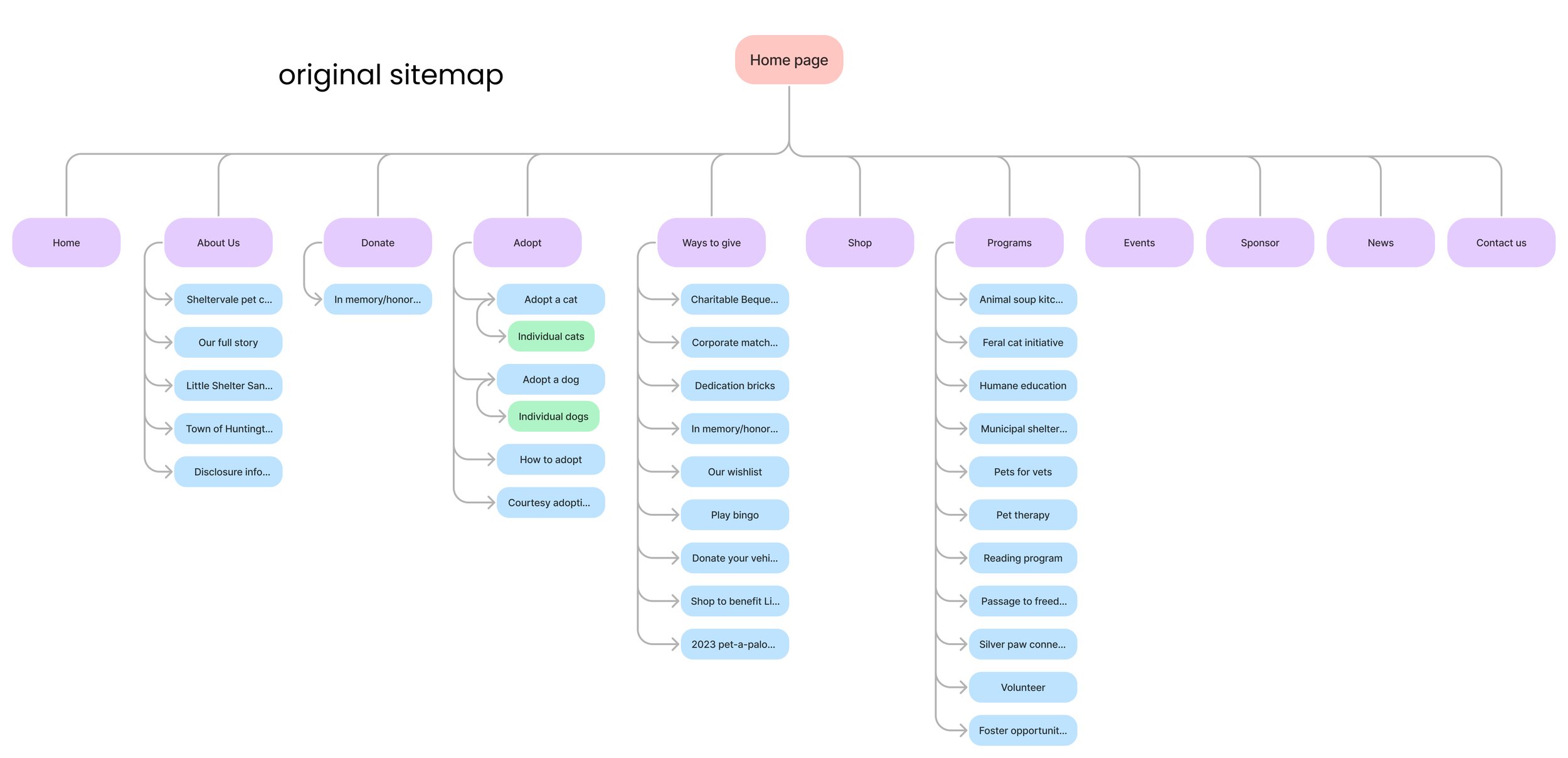

Tree testing
I reduced the number of navigational options in the header from 11 down to 4. Due to the drastic difference I felt it was necessary to test the new header alone prior to user testing the whole website after redesigns. 10 participants were recruited for tree testing (5 being from the user interviews). Due to the error rate & each user being able to quickly recover quickly form mistakes, I decided to proceed with this sitemap.
100% of users clicked to these pages correctly on their first try
Contact
Our sanctuary
Our team
Our donors
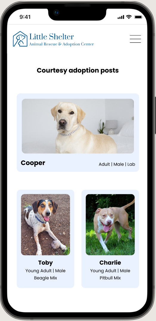
Adopt a cat
Adopt a dog
Adoption process
Donate
90% of users clicked to these pages correctly on their first try
Our program
-10% clicked “get involved” for their first try, then proceed to click “about”
Our wishlist
-10% clicked “about” for their first try, then proceeded to click “ways to give”
80% of users clicked to these pages correctly on their first try
Sponsor
-20% clicked “get involved” for their first try, then proceed to click “ways to give”
Shop
-20% clicked “get involved” for their first try, then proceeded to click “ways to give”
wireframing
Visualizing the solution
I began restructuring each page with users’ concerns being my top priority. I did this by implementing whitespace, decreasing the amount of buttons / information, and creating clear call to actions.

reference, reference, reference
Design patterns that work

While creating the wireframes I referred to an inspiration board I had made previously. Due to the abundance of nonprofits and animal shelters out there I was able to to find examples for nearly every element I needed.
Users resonated with the redesign and their feedback called for iterations
usability testing
Users expressed their love for the “straight forward, eye flattering”, redesign.
2
Prototypes
Testing was first done on the mobile prototype, followed by the desktop prototype
4
Flows
Donate, find an event to attend, find a volunteer opportunity, & browse the adoptable dogs
5
Participants
The participants that engaged in user interviews were called back for usability testing
did it work?
Overall there was 80% success rate
The usability test had an 80% success rate. I did not specify to my participants what exactly to donate to therefore 3 participants attempted to donate to the gofundme that they found by scrolling on the home page, rather than the donation button in the hamburger menu, that was the task flow at hand. Once I prompted the participants to donate to the shelter “normally; as if that gofundme section was not there” 2/3 participants proceeded to the menu and saw the donation button. The other user did not understand what I meant until they saw the donate button later when in the menu for a different task.
Although this was a miscommunication issue I feel that it was a design issue as well. I hypothesize that if the mobile prototype had a more prominent donation button then users would have clicked that before scrolling down and attempting to click the gofundme button.
Donation flow miscommunication:

Results by task:
40% of users donated to Little Shelter on their first try (mobile); 100% (desktop)
100% of users found an event on their first try (desktop & mobile)
100% of users found a volunteer opportunity on their first try (desktop & mobile)
100% users found adoptable dogs on their first try (desktop & mobile)
iterating
Addressing user feedback
Users feedback pushed for adjustments and inspired new designs
Added a donate button that scrolls with the user
60% of users did not donate to the shelter on their first try (mobile prototype) so I needed to make the donation aspect more apparent. The website originally had a pop-up when entering the site to encourage donations but users disliked the pop-up therefore I had to find a different way. I experimented with a few options and ultimately decided to go with the vertical donate button that scrolls with the user.
Changed buttons from square to pill shaped
20% of users did not like that the cats & dogs buttons were a different shape than every other button. They preferred consistency.


Updated the donation layout
20% of users suggested putting the Venmo/PayPal option in the payment section but I decided to keep the buttons in the amount section due to people using those options for a faster checkout process. I did not want users to have to fill out all of their information if they do not want to. However, I addressed the users concerns by placing the buttons within the donation card and adding wording to the “continue” button in order to make it clear that there is a decision to be made.
While iterating I had extra time so I experimented with an open overlay. When presenting the options to Designlab group critique members all 7 members preferred the open overlay over the previous page layout so I decided to move forward with it.

Updated the event card layout
20% of users felt the event images were too large. I decreased the image size a bit and added a date banner to the top left corner. In addition, I included an “add to calendar” button as well allowed for users to look at previous events by year.
visual identity
Users described parts of Little Shelter’s website using these adjectives: chaotic, unwelcoming, ugly, outdated, and low quality. I updated the logo with a modern touch, staying true to the original concept & adjusted the color palette to create a more warm, friendly, and positive environment.
Brand values brought to life

How the redesign solved user concerns
reflection
❤︎ Created a friendly ambience with clear calls to action


❤︎ Redesigned event calendar format to descriptive cards with imagery

❤︎ Expresses more gratitude & information about the shelter’s goals

❤︎ Improved upon navigation & information organization

❤︎ Volunteer opportunities are present (not hidden)

❤︎ Improved upon content placement & use of color/imagery


always continue to grow
Avoid investing too much time and effort into one initial design before receiving early feedback and conducting testing. Designs should be iterated based on feedback, so seek input early and frequently.
There are plenty more adoption centers out there that people will go to instead of spending their time trying to navigate a disorganized website. A well-structured navigation, information hierarchy, and clear call to actions are essential to prevent potential adopters / donators from abandoning a site due to difficulties in searching for what they need.
What I learned 🌱
Final Design
click screens to enlarge videos
Desktop
Mobile